Formalicious v2 Field Types
This extra is discontinued. It was originally built by Sterc and distributed by modmore as a Premium Extra, however in 2020 Sterc decided they can no longer offer the support required. It is no longer available from modmore, but may be available elsewhere.
Unfortunately modmore cannot provide standard support for this extra. You may request support from Sterc directly or consider booking Premium MODX Support if you need help with it.
A form consists of fields. These fields can be categorised by type. Formalicious is shipped with the most common field-types by default:
- Checkboxes
- File
- Number
- Radiobuttons
- Select
- Text
- Textarea
All these types have a Chunk associated with them. These can be found in the Elements-tree, below the Formalicious-category. These chunks are optimised for Bootstrap
All the required fields are implemented in Formalicious, but you can change these chunks to match your needs. It is recommended to duplicate and rename a field before changing it, because an update of Formalicious will override the original chunks.
Creating your own field type
We made the most common used input fields already available, but we offer creative freedom here. You can create your own types with your own chunks.
The following placeholders can be used
| placeholder | description |
|---|---|
| [[!+name]] | Name of the field. |
| [[!+title]] | Title of the field, used for show. |
| [[!+value]] | Data filled in form when submitted. |
| [[!+description]] | Extra description for your field. |
| [[!+placeholder]] | The placeholder attribute for your field, can also be used in different varieties. |
| [[!+error]] | Is filled when error handling is triggered for a required field or validation. |
| [[!+values]] | Contains the options for radio/checkboxes. |
Step 1: Create the type
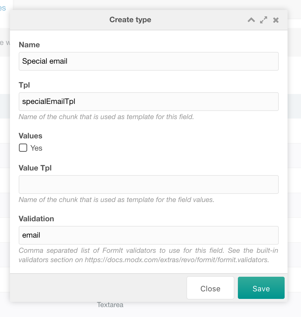
Create your type and enter a Name and Tpl. The Value Tpl field is only to determine your options for checkbox and radiobutton fields.
The Validation field can be used to use FormIt validators.
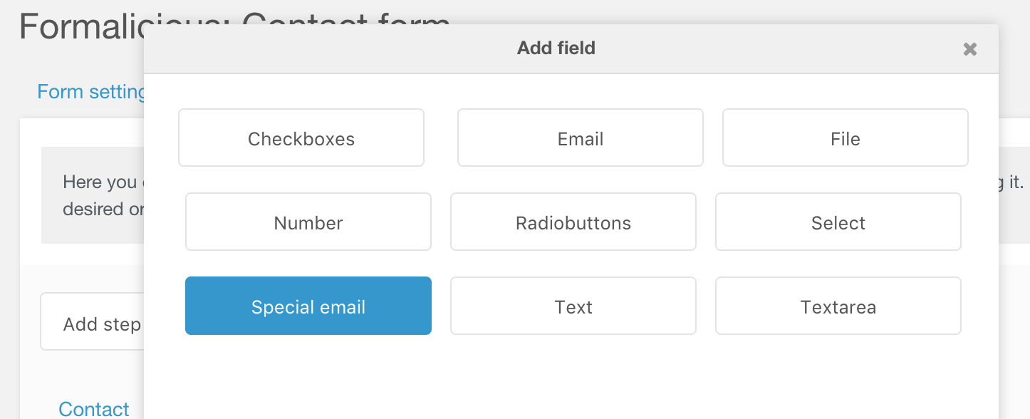
In the example below we create a field called “Special email”, with the template “specialEmailTpl”:

Step 2: Create the associated chunk
We specified the chunk called “specialEmailTpl”. This chunk is a regular FormIt-chunk. Please check the FormIt tutorials for all your options.
Below is an example of our “Special email Tpl” (copy of emailTpl):
<div class="form-group [[!+error:notempty=`has-error`]]">
    <label for="[[!+name]]">[[!+title]][[!+required:notempty=`*`:empty=``]]:</label>
    <div class="form-control--wrapper">
        <input type="email" id="[[!+name]]" name="[[!+name]]" class="form-control [[!+error:notempty=`error`]]" value="[[!+value]]" [[!+placeholder:notempty=`placeholder="[[!+placeholder]]"`]] />
        [[!+error]]
    </div>
    [[!+description:notempty=`<div class="form-control--description">[[!+description]]</div>`]]
</div>
And that’s it, you’re all set!
