ContentBlocks ContentBlocks 1.x Layouts
In ContentBlocks you can use Layouts to easily manage multi column content. Each layout has a defined set of Columns and a matching template, which gives you 100% control over the output. Layouts are great to integrate with grids such as Foundation or Bootstrap, but also seamlessly work with your own markup and layouts.
During installation you get the opportunity to install some basic Foundation and Bootstrap based layouts to get started quickly.
Table of Contents
Managing Layouts
To manage Layouts, find the Content Blocks component under the Extras menu and move to the Layouts tab.
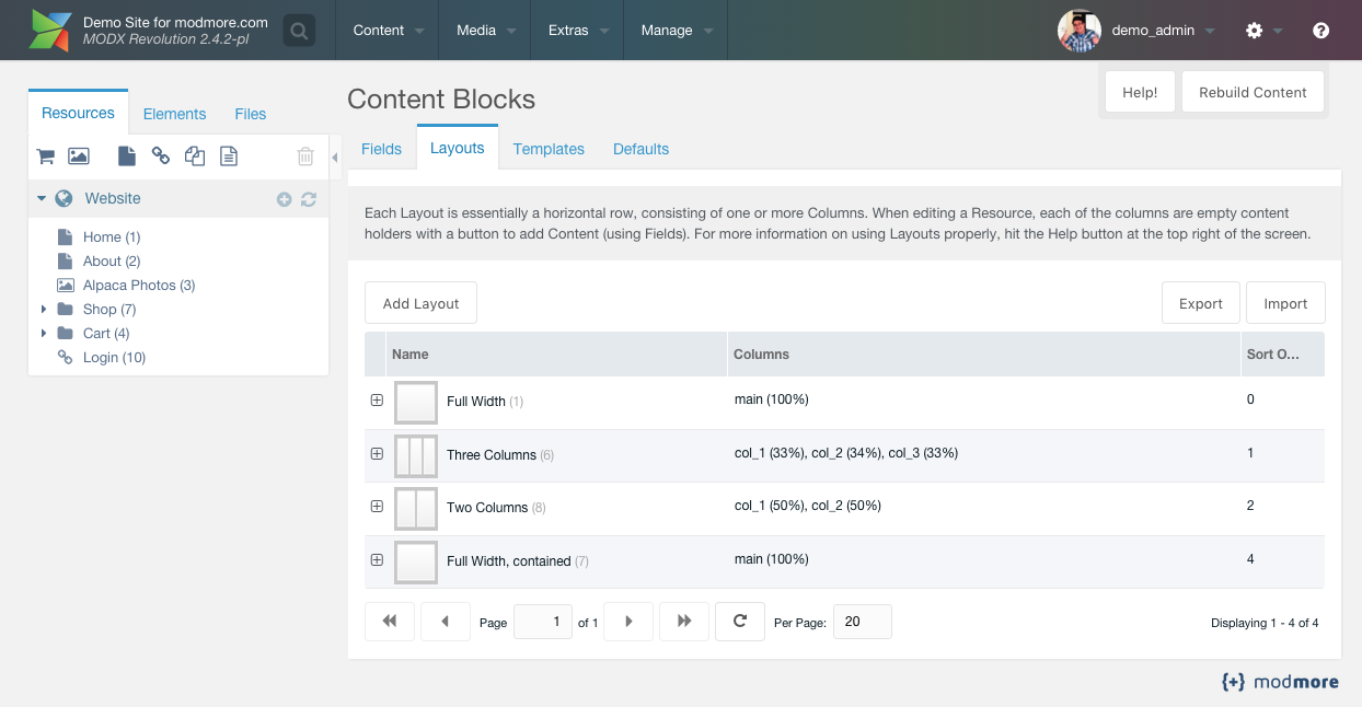
Simply click the Add Layout button or right click a layout and choose Edit Layout to open the layout window. There’s a bunch of tabs which we’ll go over in more detail below:
- General
- Template
- Columns
- Availability
- Settings
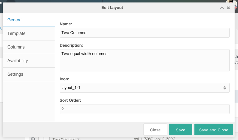
Tab: General
The General tab contains the basic information about the layout and determines how it is shown in the Add Layout modal window when editing a resource.
- Name: quite obviously, this is the name that will be visible in the Add Layout modal that we will see later.
- Description: optional, used for the title attribute/tooltip of the link to select the layout in the Add Layout modal.
- Icon: choose one of the icons for this layout; a number of different icons with different column widths are included in the package that you can use.
- Sort Order: use this to define the sort order in the Add Layout modal. Lower numbers show up first
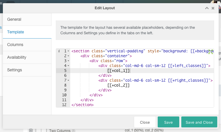
Template
In the Template tab you define the markup that this layout will use. It is possible to use snippets, chunks and other tags here, but most importantly you will need to reference the columns you define in the Columns tab so that the actual content will be inserted there.
If you create a column with reference “main”, your placeholder will be [[+main]]. If you created a second column with reference “sidebar”, that content will be available with [[+sidebar]]. In the example below, we have set up a layout using the Bootstrap grid with two columns col_1 and col_2.
Any settings you define are also available as placeholder. If you add a setting with a reference of “class”, the placeholder in your template will be [[+class]].
Other available placeholders in Layout templates:
[[+layout_title]](or[[+title]]); you can edit the layout title by clicking on the title on the canvas[[+idx]], the index (position) of the layout[[+unique_idx]], a unique index across all elements on the page (fields and layouts)
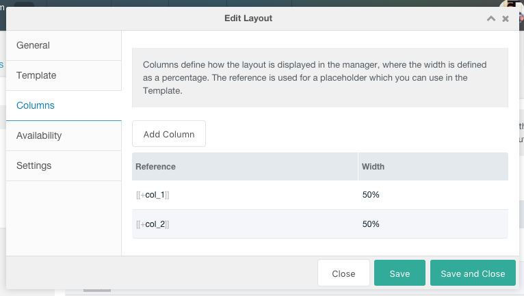
Tab: Columns
On the Columns tab you will define the way the content is shown for the content editor in the manager. You can add as much columns as you like, but for the best result try to work in multiples of 100% (a full row of content).
Note: In ContentBlocks before version 1.3, you can only use up to 100% worth of columns; any more than that and it would not flow nicely.
The reference is what is used to set placeholders for your Layout Template, so each reference needs to be: unique within the layout, contain alphanumeric characters or underscores only, may not start with a number, and preferably be lowercase. The content editor will not see these references while editing content, they only see the content canvas of the width you define.
It is suggested - but not enforced - that your primary content column has a reference of “main” and a sidebar has a reference of “sidebar”.
To add a column, simply click the Add Column button and enter the reference and width. To edit an existing column, double click the value in the grid to open the inline editor. To remove a column, right click and choose Delete Column in the context menu.
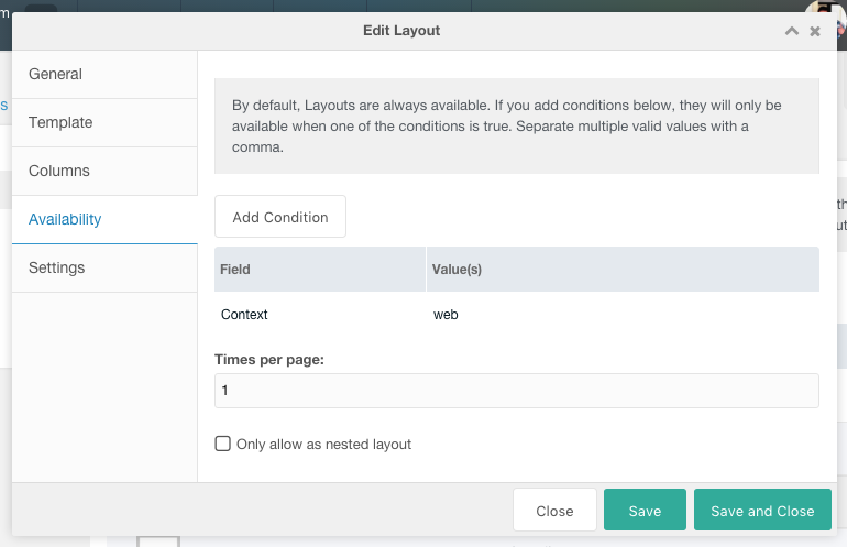
Tab: Availability
With the Availability tab, you can lock down layouts to specific users or sections of the site. By default layouts are always available, but as soon as you add one or more conditions the layout will only be available if one of the conditions is true.
It is possible to define conditions based on the following fields, all of the fields accept a comma separated list of valid values.
- Resource ID: allow this layout to be used on a specific resource.
- Class Key: allow this layout to be used on a specific resource type (for example mgResource for MoreGallery)
- Template ID: allow this layout to be used when a specific template is being used
- Parent ID: allow this layout to be used if the resource is a child of the defined parent
- Ultimate Parent ID: allow this layout to be used if the resource is a child of the defined ultimate parent (section). For top level resources, the ultimate parent is 0.
- Context: allow this layout to be used on specific contexts
- User Group (name): allow this layout to be used by specific user groups.
You can also restrict the number of times a layout is allowed to exist on a page. If you have layouts that are intended to work with the Nested Layout input type, you can also tick the “Only allow as nested layout” checkbox; that way it will only show up if the editor tries to add a layout in a layout field.
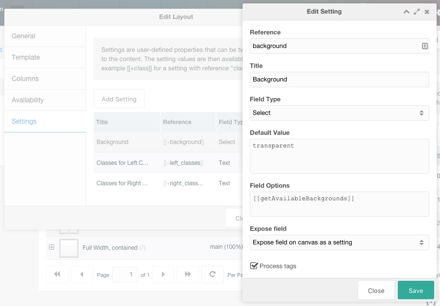
Tab: Settings
Layout Settings are options that are defined for a Layout by the site builder, but for which values are set by the editor when editing a resource. The Setting Reference is used to set a placeholder for the layout Template, the Title is shown to the editor as field label and the default value is what is used when no settings are saved by the user, and shown as the default when editing the settings in the resource.
There are three field types available for Settings:
- Text: simple text field
- Textarea: a text area field for longer content
- Select: a drop down select field
- Link: a useful field that will autocomplete resources, recognise emails to add the
mailtoprotocol and also accepts external links. - Radio options: a group of values of which only one is selected
- Checkbox options: a group of values of which multiple can be selected
When using the Select, Radio or Checkbox options, you will also see a Field Options field where you can define the different options that are available in the drop down. Simply define one value per line, and if you want a different display value use “Displayed Value=placeholder_value”. As of ContentBlocks 1.5, the format “placeholder_value==Displayed Value” is preferred to be consistent with template variables, and support for “Displayed Value=placeholder_value” will be removed in 2.0.
It’s also possible to populate the field options with a snippet, just add the snippet tag inside the field options and enable the Process Tags checkbox. There’s several pointers:
- you can use parameters in your snippet call, but make sure the whole call is all on one line or it will be broken down into multiple lines by the parser and won’t run
- don’t include a ‘!’ to run the call uncached - this breaks the call and the snippet is run uncached regardless
- make sure the snippet responds with the proper syntax
When you have defined settings for a Layout, you will probably need to reference it in the template to do something with it. Simply use the placeholder syntax with the reference you set on the setting.
The Expose Fields dropdown allows you to determine how a setting is displayed to the editor. The default value makes it accessible via a Layout Settings button in the layout header, while you can also choose to expose it on the canvas directly. When exposed directly you can choose between exposing it as a setting (slightly dimmed), or as a regular field.

Working with Layouts
Note: the screenshots in this section are a bit old; it looks like slightly different in the latest release. Sorry about that.
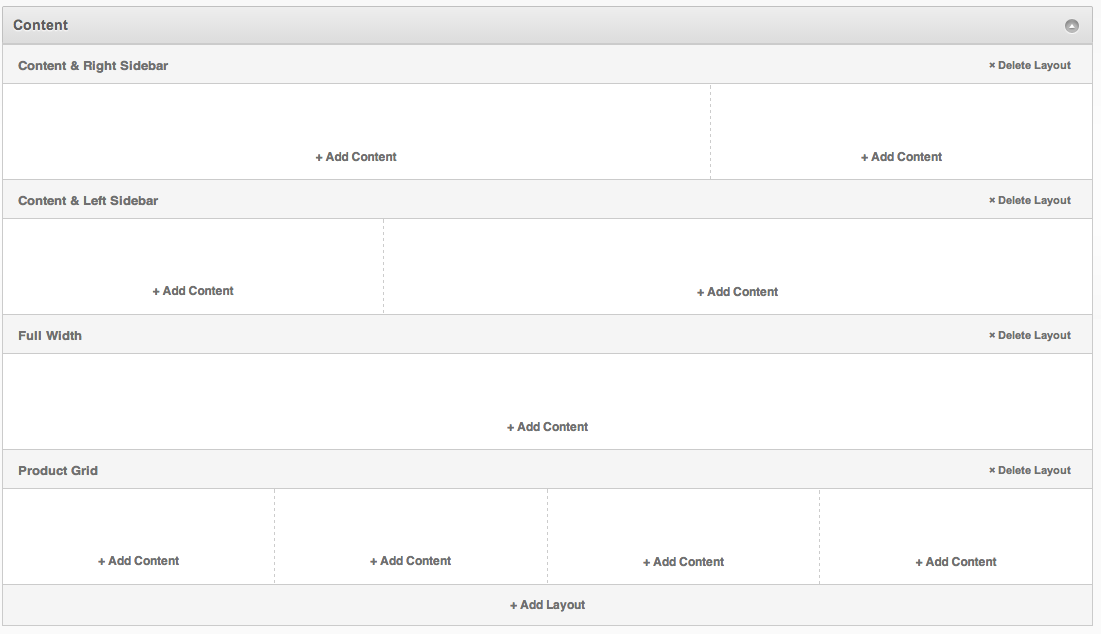
Edit or create a resource. You may see some pre-existing content or a default layout and field. To work with layouts we defined earlier, find the Add Layout button at the bottom of the content. Click it to have a modal window appear. In the example below you can see we have 5 different layouts configured with different column widths and distributions.

By simply clicking the layout we want to use it will be added to the content panel. Let’s choose the Content & Right Sidebar layout and see what that does.
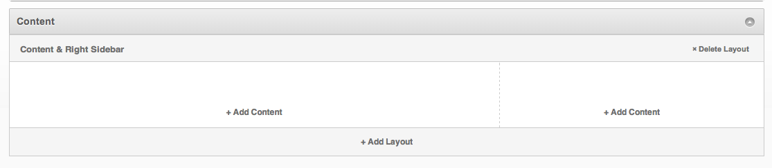
Aha! We now have two columns, one 70% width and the other one 30%. There is also an Add Content button in each of the columns, when clicked it will popup a modal window that lets you add Fields to the column. The Delete Layout button will allow you to remove the entire content in that row.
Of course you can also continue to add more layouts, making complex pages without the hassle.
Further reading: