ContentBlocks ContentBlocks 1.x Available Input Types
This page contains an alphabetical list of the built-in input types for ContentBlocks. For information on building custom input types for things that are not included, check out the Custom Inputs documentation and see the List of Available Custom Input Types for custom input types you can use.
Table of Contents
Field vs Input
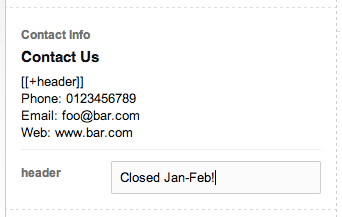
Inputs, or Input Types, control how a piece of content is managed and displayed in the front-end. From a user perspective, it’s a certain type of content.
Using these Input Types, the site builder (that’s probably you) can define Fields. A Field has a name (“Introduction”), an icon and an input type attached to it. The input type enables certain properties (such as templates) that affect how the user interacts with it, or how it is displayed in the front-end.
A single input type can be reused in multiple configurations (for example with different templates) by defining multiple fields with the input type.
Chunk
The Chunk input type is used to insert a pre-defined MODX chunk into the content. The chosen chunk will be loaded into the canvas dynamically to give a preview of what was added.
If the chunk has properties attached to it, they will be shown below the preview, allowing the user to insert bits of content into the chunk.
The chunk input type has no template. If your chunk relies on certain styling, you will probably need to use a plugin to register a CSS file in the manager to style it nicely in the manager.
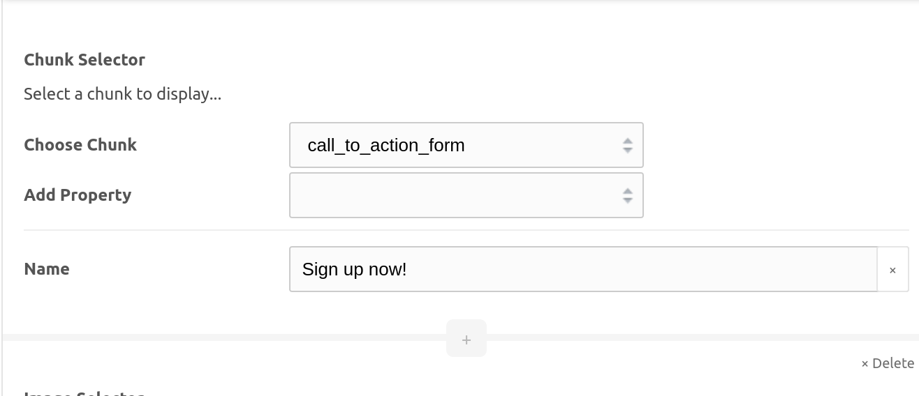
Chunk Selector
The Chunk Selector input provides your editor a way to choose a chunk to display. This is in contrast to the Chunk input, which displays a preselected chunk.
After selecting a chunk, choose a related property set to use, or specify a custom property.
Checkbox
Available in ContentBlocks 1.12 and above, this simple input type provides a checkbox that can be toggled to return a boolean output. This is especially handy in repeaters, where there may be a desire to enable or disable individual rows.
Code
The Code input is a syntax highlighted code editor. It is powered by Ace and is complemented with a drop down to change the highlighted language.
Through the input properties it is possible to customise what languages can be chosen in the drop down (defaulting to HTML, CSS, JavaScript and PHP) and which one is the default (HTML).
The template for the Code input determines how the code is displayed to the front-end. Two common scenarios are:
- Inserting a code block into the markup to display the code. In this case, it’s important to properly escape the code. In this case enable the Encode Entities property, which will make sure the `` placeholder is properly escaped (including MODX tags) for display.
- Actually interpreting the code. For example, if you need to insert some custom HTML and want to use the syntax highlighter in doing so. Simply add a template that just contains the `` placeholder.
The contentblocks.code.theme setting allows you to change the theme that is used for the syntax highlighting. You can try different themes here.
Also see this tip for Displaying (MODX) Code.
Color Picker
The Color Picker input enables editors to pick any color they fancy from the pop-up color wheel, or select from a group of curated color swatches.
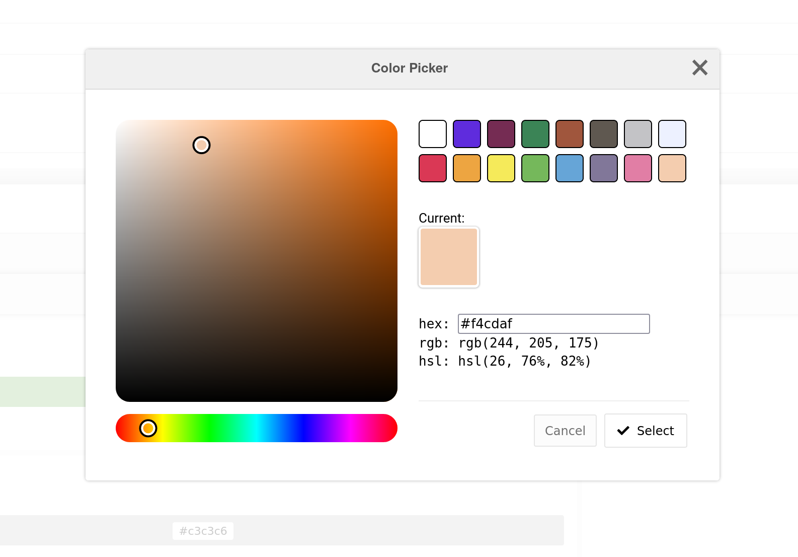
The Color Picker is available as a core input type, as well as all types of settings (as a modal, a field, or a straight-up setting).
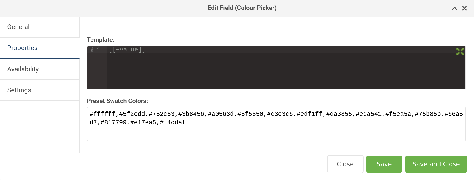
Configuration
To set the default swatch colors, edit the comma-separated values in the contentblocks.color_picker_defaults system setting.
When using a color picker input type (as opposed to a setting), you can override these presets per field via the
field Properties tab.
File
The file input allows selecting or uploading files to be downloaded as attachments by your users. Select a file and then give it a title in the provided text field; this title will then display on the download link in the output.
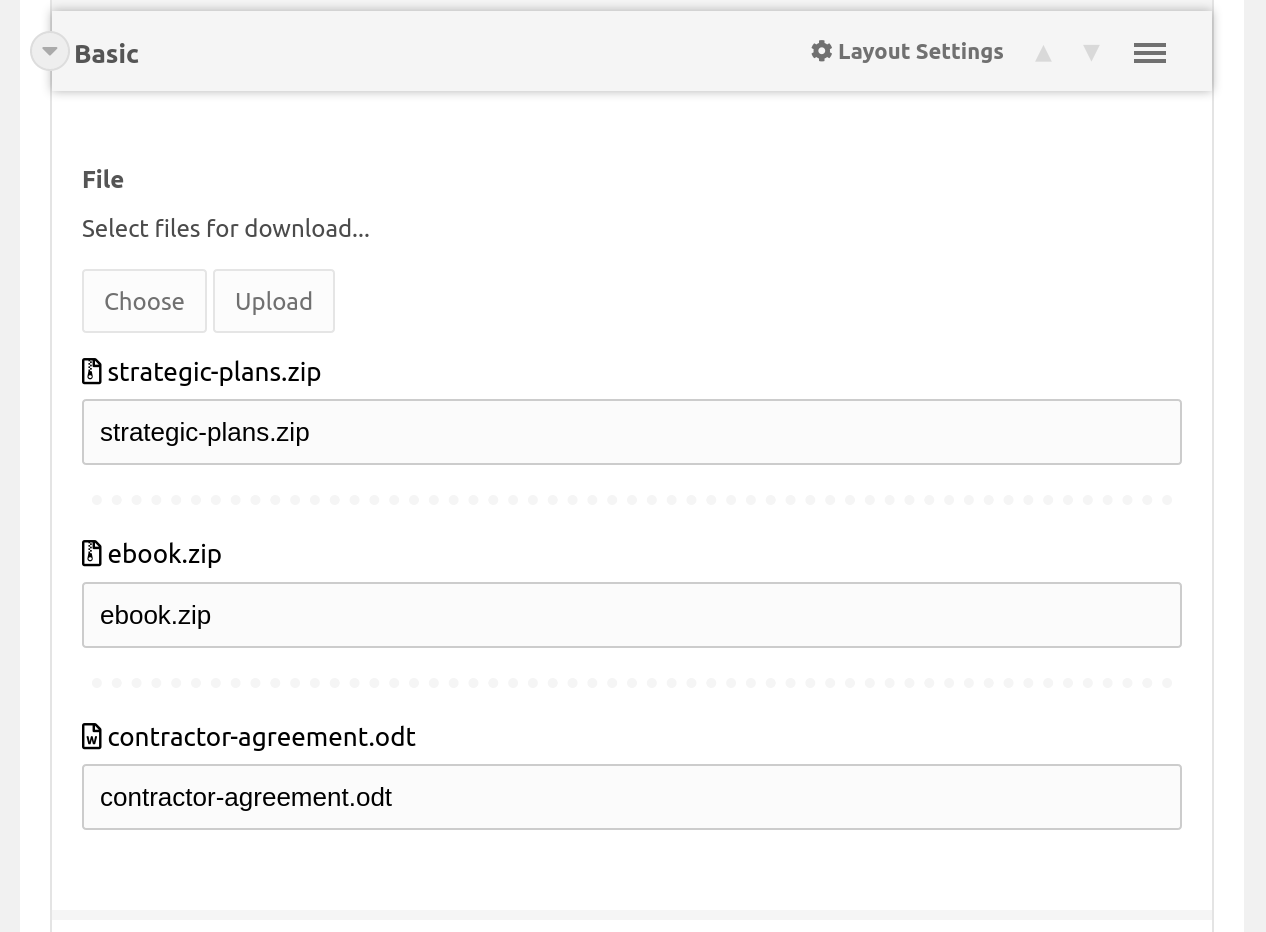
Configuration
In the field properties, you can customize the template, maximum number of files allowed, media source and directory the files will be uploaded to, and the allowed file extensions.
As you can see in the image above, there are two template fields that can be customized with your own markup. The following placeholders are available:
- Template
[[+url]]- The file URL[[+title]]- The file title specified by the user[[+size]]- The file size (note the optional:cbFileFormatSizeoutput modifier!)
- Wrapper Template
[[+files]]- A list of files with the markup specified by the above Template
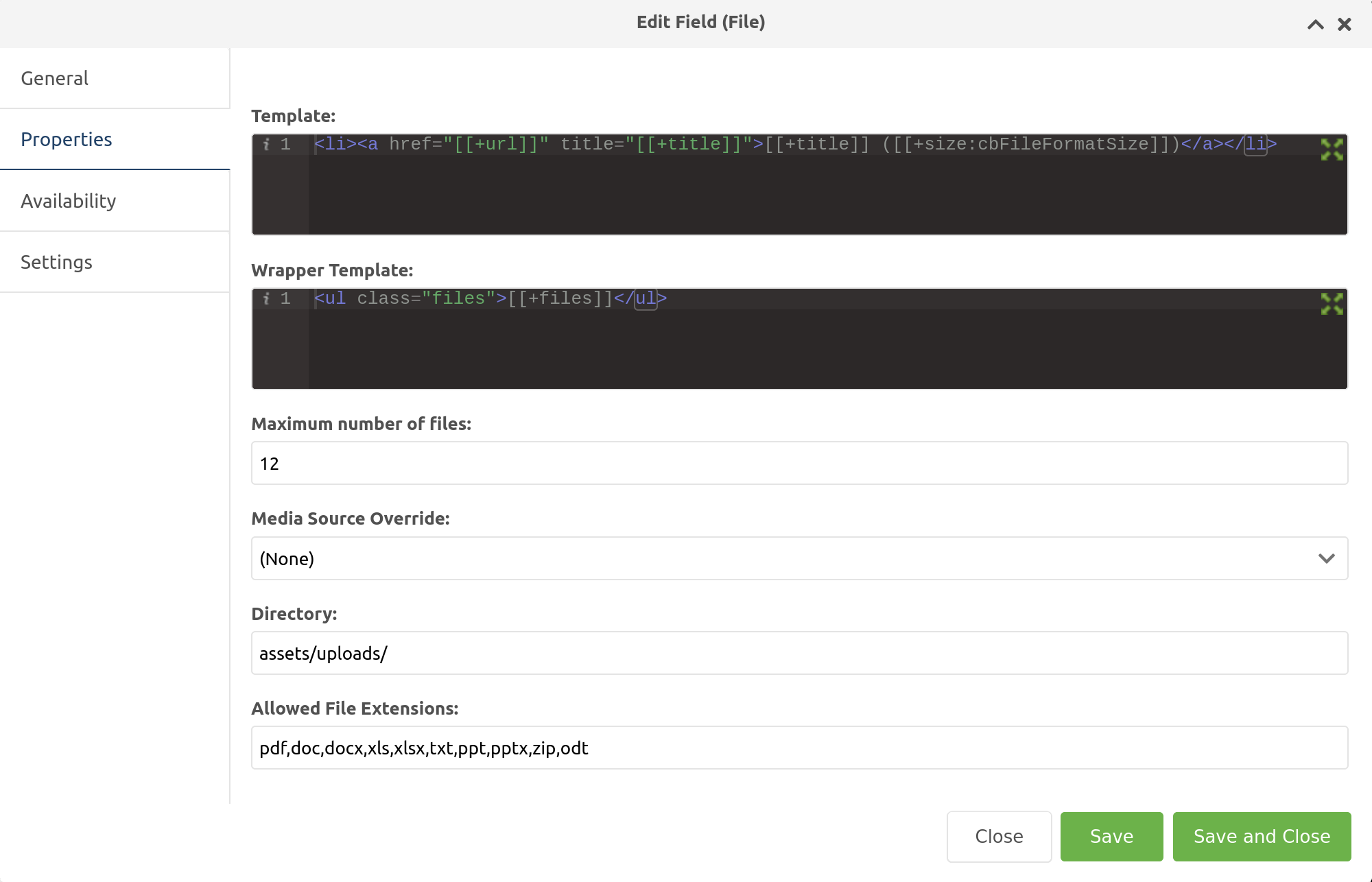
Gallery
While not quite as full featured as MoreGallery, the built-in Gallery input for ContentBlocks is quite nice. It allows you to limit the number of images editors can add and is fully template-able as you would expect.
The template property is used for each individual image (placeholders: [[+idx]], [[+total]], [[+url]], [[+description]] and [[+title]]), while the wrapper template is used to wrap the images (placeholder: [[+images]]).
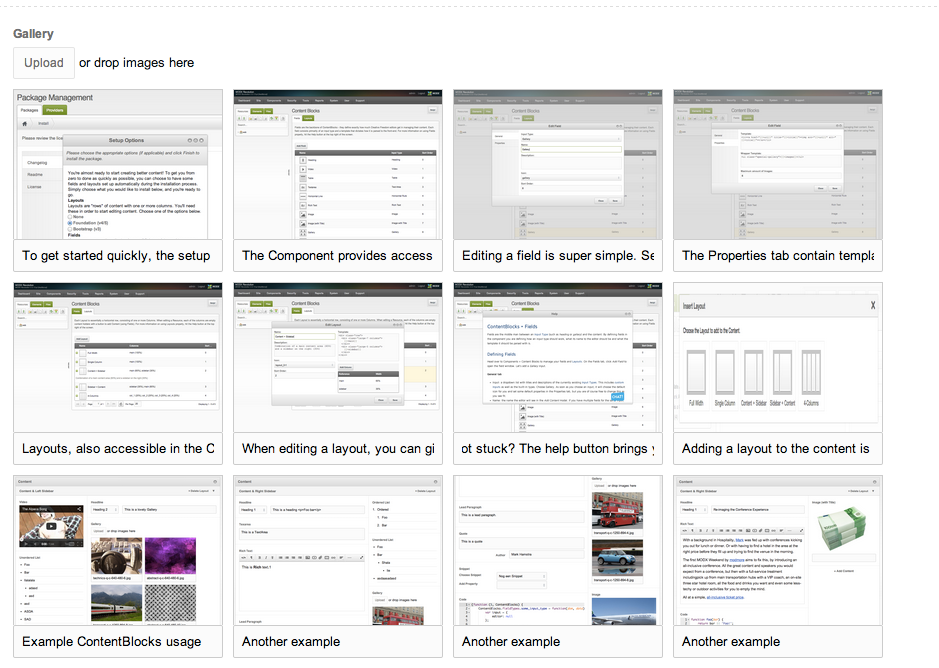
MoreGallery Image Selector
While not included in ContentBlocks by itself, if you have both MoreGallery (1.16+) and ContentBlocks installed, the MoreGallery Image Selector input is made available.
If you did not have ContentBlocks installed when installing MoreGallery 1.16+, you may need to reinstall MoreGallery before the ContentBlocks input type will be available.
The Image Selector input enables you to select an image from any MoreGallery resource to include within your ContentBlocks layout.
For more information, view the MoreGallery Image Selector documentation.
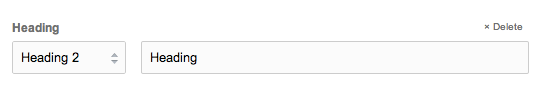
Heading
The heading input is a simple one, but extremely useful. It combines a drop down for different levels, with a text input. The default template outputs a simple heading tag, however with a bit of creativity it’s possible to make them more useful.
For example, a template could contain a link and and anchor to automatically link headings, like we’re doing on modmore.com.
Horizontal Rule
Possibly one of the easiest input types ever, this input type inserts a simple visual horizontal rule (<hr>) into the canvas. Make sure to add a <hr> (or similar markup) to the template. No preview of this input type, sorry.
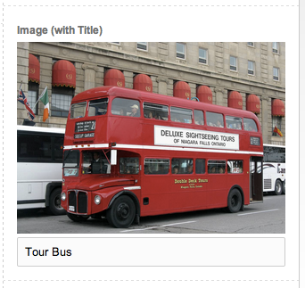
Image (+ Image with Title)
The Image input offers a super streamlined image upload, as well as the ability to select images previously uploaded to the server using the regular MODX File Browser.
Similar to how Redactor works, you can configure a bunch of settings to influence how uploaded images are handled. These are:
- contentblocks.image.source: the Media Source to upload images to.
- contentblocks.image.upload_path: the path (relative to the root of the media source) to upload images to. You can use placeholders as well:
[[+year]],[[+month]],[[+day]],[[+user]],[[+username]],[[+resource]](ID). - contentblocks.image.sanitize: when enabled, the image name will be sanitised before upload. This is done with regex and the pattern and replacement can be tweaked with the contentblocks.sanitize_pattern and contentblocks.sanitize_replace settings.
- contentblocks.image.hash_name: when enabled, the image name will be hashed (a simple md5 hash) before upload.
- contentblocks.image.prefix_time: when enabled, a unix timestamp will be prefixed to the image name before upload to ensure it’s unique.
The image with title input type is exactly the same as the image, except that it adds a title field under the image to add a title/alt attribute.
The image is available through the [[+url]] placeholder in the template, and when using the image with title you can also use the [[+title]] placeholder.

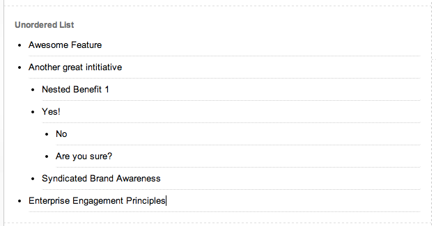
List (+ Ordered List)
Need to make complex lists? The List (and Ordered List) input type have you covered. It is built to be keyboard friendly and supports pretty much infinitely nested lists.
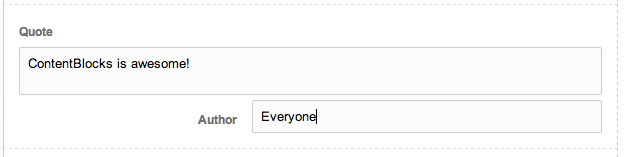
Quote
The Quote input type combines a simple textfield with a smaller input field to add the author. This works great with a <blockquote> and <cite> tag for semantic markup. The textarea grows automatically to accommodate longer quotes.
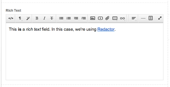
Rich Text
The rich text input uses the installed rich text editor, such as Redactor or TinyMCE, to provide the richtext editing experience your clients are already used to. If no supported rich text editor is installed, a simple textarea is shown instead.
Snippet
The snippet input provides an interface for choosing and configuring snippets. While still pretty technical, it is more accessible to editors than MODX tags. The properties are based on the properties defined by the snippet and a list of them is shown in the Add Property drop down.
If enabled on the Field properties tab, there is also the option to call snippets uncached, otherwise all snippets are assumed cached as they should be.
It is possible to filter the available snippets based on name/IDs as well as categories by configuring the properties as such.

Table
Docs to be added.

Texarea & Textfield
Docs to be added.
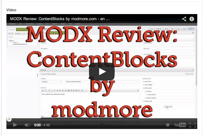
Video
The Video input allows the user to either paste in a YouTube URL, or to search public YouTube videos for a video to include in the content. In both ways the Video ID is stored in the [[+value]] placeholder, allowing you to set up the embed code as desired.