ContentBlocks ContentBlocks 1.x Fields
Fields are implementation of an Input Type (such as heading or gallery), which defines how the content added by an editor is turned into the markup. As input types often provide a number of other properties for defining how it works or what it can do, you can have multiple configurations of that with multiple fields of the same input type.
To give a simple example, you may define “Note” and “Warning” fields so editors can add callout blocks into the content. These fields would both be a textarea or richtext input type, but because their template is different, they provide vastly different use cases and visual styles in the front-end.
Table of Contents
Managing Fields
To manage fields, head over to Components and find the Content Blocks menu item. On the Fields tab, you can click Add Field, or right click a field and choose Edit Field to open the field window. You’ll find a number of tabs, which we’ll go over in detail below, to help you manage your ContentBlocks fields.
- General: used for managing the basic field information.
- Properties: input-specific properties allow you to tweak the behaviour and templates.
- Availability: can be used to configure when a field should be available to the Editor based on a number of variables.
- Settings: allows you to define configuration options or extra fields that the Editor can access when creating content.
General
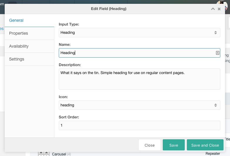
On the General tab, you can edit the basic information for this field. That includes choosing the Input type, giving it a name, description and icon for in the Add Content modal as well as defining the sort order.
- Input: a dropdown list with titles and descriptions of the currently existing Input Types. This includes custom inputs as well as the built-in types. As soon as you choose an input type (Heading in the example), it will set the default icon for you and set some default properties in the Properties tab, but you are of course free to change this as you see fit.
- Name: the name the editor will see in the Add Content modal. If you have multiple fields for the same input, you will probably give them a more distinctive name, but we’ll settle for just “Heading” here.
- Description: an optional description to add to the popup in the Add Content modal for the editor.
- Icon: choose one of the many included icons, this is used in the Add Content modal to quickly identify the field.
- Sort Order: the order in which to show the fields is defined by the sort order value. Lower numbers go first.
Properties
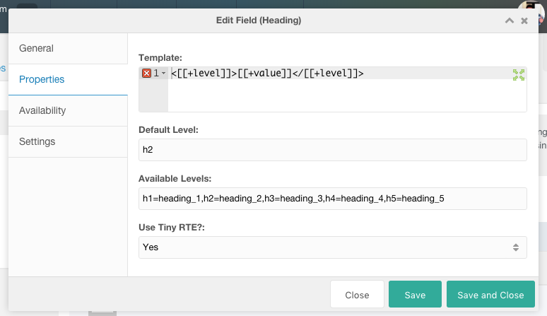
The properties tab consists input-specific properties. All inputs have a template, which typically has a [[+value]] placeholder but depending on the input type there can be more or different placeholders, templates and other properties. By hovering over the properties you will get a tooltip with more information about the property, which typically includes the available placeholders along with general instructions.
Availability
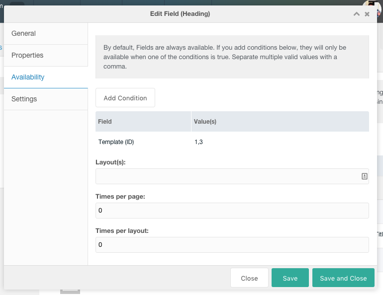
Using the availability tab it is possible to restrict fields from being used in specific situations. There are a few variables you can check against, each of them accept a comma separated list of valid values:
- Resource ID: specify a list of Resource IDs this field may be used on.
- Parent ID: allow this field to be used as long as the current resource is a child of one of the IDs in this list
- Ultimate Parent ID: allow this field to be used as long as the top level parent ID is in this list. Top level resources have an ultimate parent of 0.
- Class Key: only allow using this field of the resource is an instance of a certain class key. For example to allow using this field on a MoreGallery resource, add “mgResource” to this list.
- Context: specify the context keys this field may be used in (note: make sure you are using the context key, and not the name - in MODX 2.3 these things may be different)
- Template (ID): use a field depending on the chosen Template
- User Group (name): a comma separated list of user group names that can use this field.
Note that if any of the conditions are true, the field will be allowed to use.
By specifying a comma separated lists of allowed Layout IDs you can restrict usage of the field to specific layouts as well. Note that if you have other conditions set up, at least one of them needs to evaluate to true as well.
When fields are, based on the conditions, not allowed to be used, existing instances of the field will continue to work and the Editor can work with it as normal. They will however be unable of adding new instances of the field to the canvas.
Settings
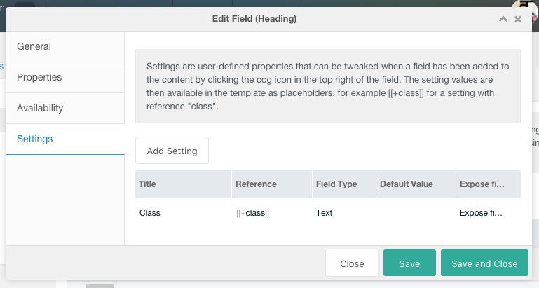
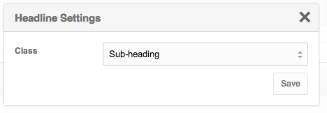
Settings are, just like Layout Settings, configuration options that you can add to a field which the Editor can then change when adding content to it. Settings are added as placeholders to the field’s template so you can easily pass, for example, a class or inline style to a fields template. In the image above we have defined a “Class” setting (which will fill the [[class]] placeholder in our template, defined on the Properties tab) with a select field type and a couple of values.
There’s also an option called Expose Fields. This option allows you to define how the setting is made available to the editor, which is one of the following:
- Show field setting in modal window: this is the original approach to field settings, where you need to click a small cog icon at the top right of the field in the canvas, which will then open up a modal window with your settings.
- Expose field on canvas as a setting: this will create a new block below the regular field in a slightly dimmed color, with a “Content Settings” heading. This can help your editor understand it is a setting and not the main content.
- Expose field on canvas as a regular field: this will create a field that visually looks the same as other input types, without being obvious to the editor that it is a setting. This is a great way to extend input types to collect more data, without requiring creating a custom input.
When we chose the modal window option and editing a resource, we inserted the headline field. When hovering over the field, the cog symbol in the top right indicates there are settings that can be changed, as such (arrow added for emphasis):
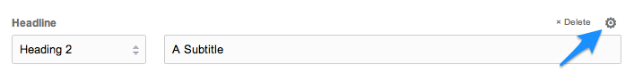
Clicking the cog symbol will open the “Headline Settings” modal (we named our field “Headline”) which allows us to choose one of the defined classes in the dropdown.