MoreGallery MoreGallery 1.x Cropping
As of MoreGallery 1.3, it is possible to set up region-of-interest cropping. With this feature, the designer or developer defines the different crops that should be available and the end user then selects the right part of the image when it has been uploaded.
The crops can optionally specify the aspect ratio it should use, as well as the size of the output image.
Table of Contents
Setting up Crops
To set up crops, you’ll update the moregallery.crops system setting. Its value is a specially crafted string containing one or more crops, separated by the pipe symbol (|).
Here’s an example of what the setting might contain:
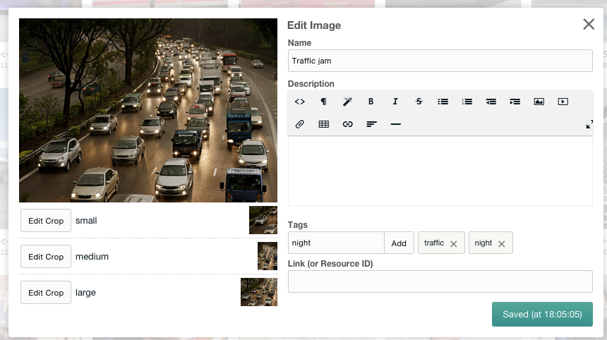
small:width=200,height=200,aspect=1|medium:width=500,aspect=0.7|large:height=750
The syntax uses a pipe symbol (|) to separate different crops. Each crop is available as an item under the image when editing its information. In the above example, we defined three different crops: small, medium and large.
For each of the crops, the definition starts off with its name, followed by a colon (:) separating it from the crop options.
The name is displayed to the user when editing an image, and also used for the placeholders with the mgGetImages snippet.
If your name needs to include special characters, or if you want to translate it into different languages, you can use lexicons for the name. Set the name to a simple string like “thumbnail”, and create a lexicon entry for “crop_name.thumbnail”. The easiest way to add this lexicon is to add it to the core or moregallery lexicon via System > Lexicons.
Options are separated by a comma (,) and are specified in the key=value format. There are currently four supported options:
-
aspect: the aspect ratio is the
widthof an image, divided by itsheight. A square image has an aspect ratio of1, while a landscape image has an aspect ratiobigger than 1and a portrait image has a aspect ratio ofsmaller than 1. To set the aspect ratio, addaspect=1.3where 1.3 is the ratio you want to enforce with a period as decimal sign. When no aspect ratio is defined, the user has the ability to select any type of rectangle. - default_aspect: if you only want to use a specific aspect ratio for the automatically created crop on upload, while allowing the user to select any aspect ratio later, you can use default_aspect for that. This works exactly the same as aspect, except it is not enforced after upload.
- width: a width in pixels to limit the selected crop to. This does not restrict the size of the selected region, but it will make sure the generated image is at most that wide.
- height: a maximum height in pixels. As with the width, this does not restrict the size of the selectable region but only affects how the image is generated.
The end-user does not see these settings directly, however they do see the results. Their crop selection will be restricted to the aspect ratio you define and the image will be generated at the right size determined by the width and height.
First-time Crop Generation
MoreGallery automatically builds cropped versions of each of the crops, for each of the images. This happens when uploading an image for the first time.
If you’ve just added a new crop to an existing configuration or changed the name of a crop, it will also generate crops for existing images. This cropping happens when listing images in the Gallery resource view, or when the image is requested in the front-end. Generating the crops for a large amount of images may take a fairly long time (around a second per image with 3 crops), and temporarily causes high resource usage on the server.
In both scenarios MoreGallery uses the defined aspect ratio and width and height to figure out how to create the crops. This way, you can be sure the configured crop is actually available when displaying the gallery.
Updating your Snippet Calls & Templates
You’ll probably want to display the crops in your front-end once they’re generated. This can be done by using some new placeholders that are available in the imageTpl and singleImageTpl chunks, in the mgGetImages snippet.
The crop placeholders follow the format: [[+crops.{CROP_NAME}.{CROP_VALUE_KEY}]] where {CROP_NAME} is the name of the crop as it was defined in the moregallery.crops system setting (for example small, medium or large in the earlier example), and {CROP_VALUE_KEY} is one of the below.
-
thumbnail_url: A fully qualified URL to the cropped image, based on the media source base url, plus the source relative url defined for the gallery and thethumbnailvalue. For example/assets/galleries/123/_thumbs/small_456_filename.png -
thumbnail_path: A fully qualified Path (for server-side use) to the cropped image, based on the media source base path, plus the source relative url defined for the gallery and thethumbnailvalue. Note that with remote media sources such as Amazon S3, this may be a remote resource. For example/home/modmore.com/public_html/
assets/galleries/123/
_thumbs/small_456_filename.png -
thumbnail: The filename of the cropped image, including the directory relative from the gallery folder. To show the image usethumbnail_urlinstead. For example_thumbs/small_456_filename.png -
widthThe width, in pixels, of the cropped image. This may be different from the “selected” width depending on your crops configuration. For example200. -
heightThe height, in pixels, of the cropped image. This may be different from the “selected” height depending on your crops configuration. For example300 -
x,y,x2,y2: The coordinates (in pixels) of the selected (or automatically calculated) crop.(x, y)is the coordinate of the top left corner, while(x2, y2)is the coordinate of the bottom right corner. For example the values may be100,0,350,350 -
cropThe name of the crop as it appears in your crops configuration. For examplesmall -
idAuto-incrementing ID for the crop record. This ID is unique across all crops. -
imageThe ID of the image this crop belongs to.
So for example if your crop was called small, you could get the url for the cropped image with [[+crops.small.thumbnail_url]], its width with [[+crops.small.width]] and the height with [[+crops.small.height]].
Using these placeholders, you can add your crops in the way you’d like them to appear in your imageTpl chunk! Perhaps using the picture elements, or simply to highlight different areas of an image.
<div class="image">
    <a href="[[+view_url]]" title="View [[+name]]">
        <img src="[[+file_url]]" alt="[[+name]]">
    </a>
    <div class="row">
        <div class="large-4 columns">
          <h3>Small</h3>
          <img src="[[+crops.small.thumbnail_url]]"
               width="[[+crops.small.width]]"
               height="[[+crops.small.height]]" >
        </div>

        <div class="large-4 columns">
          <h3>Medium</h3>
          <img src="[[+crops.medium.thumbnail_url]]"
               width="[[+crops.medium.width]]"
               height="[[+crops.medium.height]]" >
        </div>

        <div class="large-4 columns">
          <h3>Large</h3>
          <img src="[[+crops.large.thumbnail_url]]"
               width="[[+crops.large.width]]"
               height="[[+crops.large.height]]" >
        </div>
    </div>
</div>
The above code would result in something roughly like the image below.

We give you the tools to go nuts with possibilities, now it’s up to you to decide how to integrate these crops into your design!
For those looking to use the picture element, this page will explain how to set up responsive images with the picture tag in more detail.
If you have any questions about crops, please don’t hesitate to get in touch with [email protected] - we would be happy to help!