ContentBlocks ContentBlocks 1.x Available Input Types Repeater
The Repeater input type is a truly powerful input type, that allows you to create groups of fields (supporting all other input types), arranging them in a nice row, and then repeating that group multiple times. Each individual field is parsed using its input type parser, making sure that even input-specific processing is done as expected.
Kind of like MIGX, but prettier and right inside your ContentBlocks canvas.
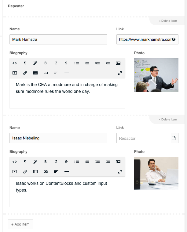
In the example image below you can see a Staff Repeater, where each row (item) is a staff member. The configured group has a textfield, link, richtext and image field to provide a complete picture of the staff member. By hitting the Add Item button, more rows are added when the team grows.
The items can be sorted by drag & drop and the maximum number of items is also configurable.
- Key repeater
-
Template Placeholders
[[+idx]]and more depending on your configured group - Requirements ContentBlocks v1.2
On this page
Table of Contents
Example
Use Cases
- Documentation (list of properties / settings / other tabular-ish data)
- Sliders / Banners where each row is a frame
- A element where multiple images can be uploaded for specific sizes
- Staff pages where each staff member is a row in the repeater
- Anything you may have stored in MIGX previously
Available Properties
Template
The template for each row of the repeater. This can use the [[+idx]] placeholder, as well as [[+total]], and the placeholder for each of the fields in the repeater group.
Wrapper Template
The wrapper template is wrapped around the output of all rows. It has a [[+rows]] placeholder which contains all the rows of content, as well as a [[+total]] placeholder.
Group
The group contains all the fields that make up the repeater. All the fields have a key, which matches a placeholder that can be used in the Template property, and a width, which determines how the field is shown in the backend.
Read the next section (Setting up a Repeater) to learn how to use a repeater.
Row Separator
A string to use between each row of content.
Maximum number of Items
The maximum number of rows that can be added to the repeater. If the editor reaches this limit, the Add Item button is removed from view until a row is deleted anymore.
Tip: set both the minimum and maximum to 1 to use the Repeater as a “group” instead of a repeater. Since ContentBlocks 1.6 this will also streamline the interface.
Minimum number of Items:
The minimum number of rows that need to be in the repeater. The delete button is removed from view if this number of items exist in the repeater.
Tip: set both the minimum and maximum to 1 to use the Repeater as a “group” instead of a repeater. Since ContentBlocks 1.6 this will also streamline the interface.
Automatically add first item:
When set to yes/true, an empty first item is automatically added when the repeater is inserted into the page.
Setting up a Repeater
Because of it’s amazing flexibility, setting up a Repeater field is a bit more tricky than your average one. However, don’t worry - we’re right here to walk you through the process. Got stuck anyway? Shoot us an email - we’d be glad to help you out.
To understand what exactly happens, we’ll start with a fully set-up example for a staff page, and break it into the different pieces.
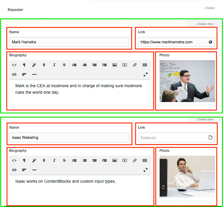
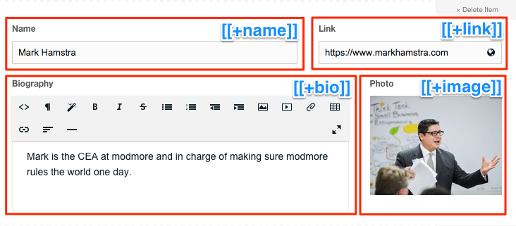
What you’re seeing, with the green outline, is the item or row in the repeater. In this particular image, we have two rows for staff members.
Each row is build up from 4 different fields (inputs) outlined in red:
- a textfield input for the name
- a link input to get a url for the staff member (more about the link input type here)
- a rich text input, using our own Redactor, for the biography
- an image input type for a staff photo, or some stock photography
Let’s go over how we set this up.
Setting up the Repeater Field
Go to Extras > ContentBlocks (or Components > ContentBlocks prior to MODX 2.3) and choose to create a new field on the Fields tab.
For the Input Type, choose Repeater. Give it a Name such as “Team”. In our example, it’s just called “Repeater” but you can be more creative. Optionally, add a description and choose a different icon.

Save the field, and right click it in the Fields grid and choose Update. Reloading the window after saving is needed to enable the Group field on the Properties tab.
On the Properties tab let’s first look at the Group. The Group is where you configure which input types are used in the rows, and also how they are shown in terms of width and alignment. Basically, together with the Template this is where the Repeater magic happens.
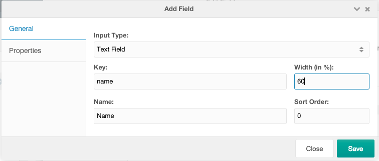
Let’s add the first field to the group, the name. Click the Add Field button. In the modal that popped up..
- Set the Input Type to “
Texfield”. This determines how the field will show up in the repeater row, and also how it is parsed. - Set the Key to “
name”. The key is how we can access the value later as placeholder ([[+name]]), so this is an important step. - We’d like the name to use a bit more space, so set the Width to
60. - Set the name to something that explains what the value should be, so in this case we set the Name to
Name… makes sense, right? - As this is the first field in the group, we leave the Sort Order at
0.
At this point, here’s how your modal should look - but we’re not done yet.
One thing that is super important to realise, and at the same time pretty complex, is that the value a user enters, will be parsed through the input type before being returned as a placeholder to the repeater row.
So with our Name field, if we go to the Properties tab, we can set its Template. By default it will be <p>[[+value]]</p>, meaning the [[+name]] placeholder in the Repeater field template will be wrapped in that template. Say we enter John Smith as name, we will actually get that back as <p>John Smith</p> in the Repeater template.
We’ll get back to that in a bit as we discuss the Template for this repeater field, but keep that in mind as you add more fields in a minute.
For now, set the Template for our Name field to just [[+value]], so without the wrapping paragraphs, and Save the field. Awesome, your first field has been added to the group!

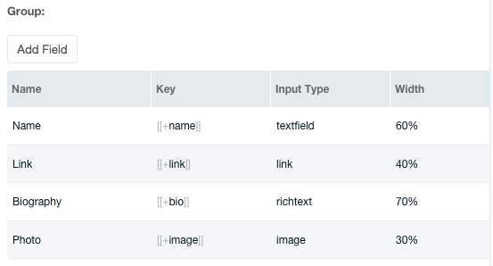
Now add the rest of the fields. This works the same, except we use different input types. Here’s what we’ve configured:
Link
- General Tab:
- Input Type: Link
- Key: link (so the placeholder will be
[[+link]]in our Repeater template) - Width: 40% (so together with the name, this will fill 100% of the width)
- Name: Link
- Properties Tab:
- Template:
[[+link]](we’ll wrap it in an<a>tag later)
- Template:
Biography
- General Tab:
- Input Type: Rich Text (which will use Redactor or TinyMCE, depending which is installed)
- Key: bio (the placeholder will be
[[+bio]]) - Width: 70%
- Name: Biography
- Properties Tab:
- Template:
[[+value]]
- Template:
Photo
- General Tab:
- Input Type: Image
- Key: image (the placeholder will be
[[+image]]) - Width: 30%
- Name: Photo
- Properties Tab:
- Template:
<img src="[[+url]]">
- Template:
All set? Great! Let’s see the defined group and how it should show up in the canvas side by side (click to see slightly bigger images).
Now let’s move on to the Template. The Template is how each row in the repeater is displayed, while the Wrapper Template is used as a wrapper. As we built our site with Zurb’s Foundation we’ll use markup and classes for that, but you can of course use this with any type of markup/css.
This is what we’d like our repeater to look like (though you can probably design something a lot prettier!):
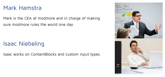
Basically it’s two simple columns. The left column contains a heading tag with the staff name, where the heading is linked, followed by the biography. The right column shows the staff picture.
Using the field keys we configured when setting up the Group, we can put the data into the repeater Template where we want it to show up. So let’s assume this is the target markup for Foundation 4/5 and our design:
<div class="row">
    <div class="small-8 columns">
        <h2 class="subheader"><a href="https://www.markhamstra.com">Mark Hamstra</a></h2>
        <p>Mark is the CEA at modmore and in charge of making sure modmore rules the world one day.</p>
    </div>
    <div class="small-4 columns">
        <img src="/assets/uploads/path/to/image.jpg">
    </div>
</div>
Then this would be our Repeater Template:
<div class="row">
    <div class="small-8 columns">
        <h2 class="subheader"><a href="[[+link]]">[[+name]]</a></h2>
        [[+bio]]
    </div>
    <div class="small-4 columns">
        [[+image]]
    </div>
</div>
The placeholders in the template correspond with the keys we assigned to the fields in the Group. The value in those placeholders have been processed already by their input types, so for example the [[+image]] placeholder already contains an <img src=".."> tag. The [[+total]] placeholder is also available with the total number of items in the repeater.
To make sure the rows actually show up, we also set the Wrapper Template to [[+rows]].

And that’s it. Save everything, edit a resource and insert the repeater. Add content, save the resource and see the magic on the front end of your site.
Limitations
- Settings are not supported on individual fields within the group or on row level